Monday, November 29, 2010
Illustrator + InDesign + Photoshop = FUN!
I'd imagine working with all three programs wouldn't be much of a issue seeing as though each could offer some type of unique addition to a newsletter. First I would start by creating some type of logo or emblem for the newsletter using Adobe Illustrator. I've learned through our brief time using Illustrator, this program is excellent for creating logos. Depending on if I would like to resize, crop, or alter images for the newsletter I would use Adobe photoshop. Finaly I would design and create the newsletter using InDesign. I'm most familiar with this program and would prefer using this software design the newsletter.
Wednesday, November 17, 2010
The Apple Brand
This week we were expected to complete a post on the following.--> Post an advertisement for a company that you think is well-branded. Talk about how their brand is seen in light of that particular ad or ad campaign.
In my opinion Apple branding is one of a kind. Their branding/marketing department deserves every last penny they earn. The master mind team almost always successfully accomplishes a well thought out, strategic plan and placement of advertisements. I remembered living in New York looking at iPod ads in the subway stations thinking to myself, "I know I have a iPod but maybe I need a new one because these ads are soooo cool". Apples branding and advertisements usually drive consumer want and not consumer need. They position their products as a luxury of sorts not a necessity.
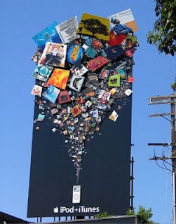
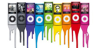
The brand is very colorful and usually bold in statement. I remember the color iPod nano ad campaign. I saw ads like the one featured below, plastered all over subway stations, billboards and commercials. Again, I think apple products are pushed onto the consumer by the company. We don't necessarily need a new version of the iPod Nano every holiday season. They create a new product and through clever advertising convince the masses this IS what you need. Regardless, I find their marketing/advertising very successful seeing as though I've purchased 2 iPods, 2iPhones, and just recently purchased a Mac Book. (All of which I didn't really need, except for the MacBook)
In my opinion Apple branding is one of a kind. Their branding/marketing department deserves every last penny they earn. The master mind team almost always successfully accomplishes a well thought out, strategic plan and placement of advertisements. I remembered living in New York looking at iPod ads in the subway stations thinking to myself, "I know I have a iPod but maybe I need a new one because these ads are soooo cool". Apples branding and advertisements usually drive consumer want and not consumer need. They position their products as a luxury of sorts not a necessity.

The brand is very colorful and usually bold in statement. I remember the color iPod nano ad campaign. I saw ads like the one featured below, plastered all over subway stations, billboards and commercials. Again, I think apple products are pushed onto the consumer by the company. We don't necessarily need a new version of the iPod Nano every holiday season. They create a new product and through clever advertising convince the masses this IS what you need. Regardless, I find their marketing/advertising very successful seeing as though I've purchased 2 iPods, 2iPhones, and just recently purchased a Mac Book. (All of which I didn't really need, except for the MacBook)

Tuesday, November 9, 2010
Brand/Logo Recognition

 Above are two examples of logos that work. I like the choice of typeface for both logos. Although Meghan suggest using typefaces that aren't cursive I think the typeface used for the Kellogg logo fits the brand. Actually I'm not certain if it fits the brand or if I'm accustomed to seeing this logo.
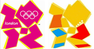

Above are two logos that I really don't like. I used to be a gril scout and I always thought the logo was pretty bland. The other logo is the official logoo for the 2010 summer olympics in London. The numbers in the design aren't clearly designed and the typeface used is really hard to read. The colors used don't best reflect the brand or the event.
Wednesday, November 3, 2010
Positive vs. Negative Color
Last class we briefly learned about the role color plays in our designs. So I looked through a view Essence Magazines to try and find spread where the color worked well and maybe not so well with the spread/design. Below are my two choices.
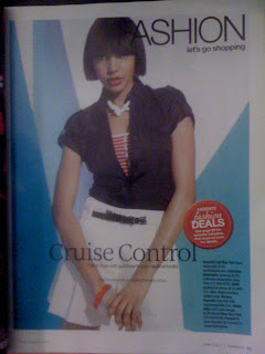
Here is a copy of color working positively within the spread. The model is wearing a white skirt, blue jacket, and red and white stripped top. The background is very simple, but a great use of color to liven up the page. The two shades of blue are used as spotlights in the spread and provide a excellent contrast.
 Below is a copy of a spread using color negatively. I actually think there is entirely too much color in this spread which can cause some distraction. I understand the purpose of the advertisement is to highlight the artist featured in the upcoming Essence Festival, but I'm too distracted by the colors and shapes to really comprehend what's most important. It doesn't seem like there is a clear color palette, just a few pretty colors thrown on to a page.

Here is a copy of color working positively within the spread. The model is wearing a white skirt, blue jacket, and red and white stripped top. The background is very simple, but a great use of color to liven up the page. The two shades of blue are used as spotlights in the spread and provide a excellent contrast.
 Below is a copy of a spread using color negatively. I actually think there is entirely too much color in this spread which can cause some distraction. I understand the purpose of the advertisement is to highlight the artist featured in the upcoming Essence Festival, but I'm too distracted by the colors and shapes to really comprehend what's most important. It doesn't seem like there is a clear color palette, just a few pretty colors thrown on to a page.
Monday, November 1, 2010
Tricks We've Learned in Photoshop
 Here's a picture I took from the top of a Mayan Ruin in Cancun. I love this picture because it represents me finally confronting my fear of falling. (I know kind of weird) I climbed to the very top and could see clear over the tops of the trees expanding the entire jungle. Sooooo.... I decided to play around with a few filters of this picture because I love this tool.

Tuesday, October 19, 2010
Simple Grid Structures


This is a simple 2 column grid I found in the latest issue of Essence Magazine. Sidebar: I've noticed most women's magazines have gotten away from the traditional magazine story and are now filled with advertorials and multiple page-image/picture spreads. This structure was very easy to identify because of the simplicity of the layout. The columns each spread about half of the page with accompanying images that span the full width of the page. (the left hand page) This wasnt one of the best layouts I've seen, rather pretty easy to interpret.
Tuesday, October 12, 2010
Nice Layouts!


I chose this layout on "Love,Sex & what I weighed" because the layout is familiar to what we discussed in class. I usually pick up a magazine and read the article based on my interest in the subject. Assisgnment 3 has forced me to look more into the layout and design of the spread. I'm huge on graphics or pull quotes which tend to break up the monotony of reading the article from beginning to end. Graphics are a great way to distract the reader from simple text on a page. The first two pages of the spread are limited in text. What drew my eye to the article were the bright contrasting colors and the various weights of the text. The second page of the spread is a full page graphic. On the 3-4 page of the layout the designer is working on a 8 column grid with the last two columns on the 4th page combined for a testimonial/quote section. Throughout the spread the designer used pull quotes and animated graphics to break up the text. The pull quotes and graphics appear on the 2nd, 4th, and 6th columns. This spread seemes simple enough to duplicate, yet was very visually pleasing without bombarding the reader with too many graphics or text. Its actually a great balance. I picked this spread because it was well executed and a great precursor to whats expected in our third assignment.


Monday, October 11, 2010
Building Ideas for PBDS502
Since I've begun working with InDesign it seems as though everyone is soliciting my help for graphic design projects.
That information aside, I generally sketch ideas before I begin working with the program. Becoming more familiar with the software has allowed me to actually follow through on a lot of my visions for projects. My very first assignment using InDesign was a disaster. But as the semester has gone along I've gotten better at incorporating more creative ideas into my design while learning the seemingly endless possibilities of the program. I look forward to other project and ways to use the software effectively.
That information aside, I generally sketch ideas before I begin working with the program. Becoming more familiar with the software has allowed me to actually follow through on a lot of my visions for projects. My very first assignment using InDesign was a disaster. But as the semester has gone along I've gotten better at incorporating more creative ideas into my design while learning the seemingly endless possibilities of the program. I look forward to other project and ways to use the software effectively.
Tuesday, September 28, 2010
Creative Print Pieces
I chose these three ads from both Glamour and Essence magazines. Starting with the Fresh Step ad, I think the image was a very creative way to advertise the product. The text was limited to one line but justified the use of the accompanying image. The cat is ceneterd in the middle of the page drawing direct focus. The text reads, "Cats everywhere are having a hard time smelling their litter boxes." The second ad,is very creative given Coach is a leather goods company. The text is centered below the image. There is very little text which allows for more interpretation of the image. The colors are contrasting and vibrant. I think the designer did a excellent job of using the space on the page.


The verdict is still out on this ad. I think it may be a bit too much text, but the text is quite and does a great job of advertising and explaining the purpose of the product.


The verdict is still out on this ad. I think it may be a bit too much text, but the text is quite and does a great job of advertising and explaining the purpose of the product.

Tuesday, September 21, 2010
Asymmetry vs. Symmetry
Symmetrical Design
I've always noticed these HSBC ads in the airport terminals. The ads are very simple usually consisting of four pictures, four words, and a red border. These ads are perfectly symmetrical generally flip flopping the images and words playing with the observers point of view.

Asymmetrical Design
I found this ad online looking through fashion spreads and performing a fashion search. The design of this ad is my idea of subtle asymmetry. When comparing both images there are a few differences. For example the arm of the model in the right image is higher, the head is tilted slightly, and the pocket book is facing the side. These subtle asymmetrical differences make the ad more interesting.

I've always noticed these HSBC ads in the airport terminals. The ads are very simple usually consisting of four pictures, four words, and a red border. These ads are perfectly symmetrical generally flip flopping the images and words playing with the observers point of view.


Asymmetrical Design
I found this ad online looking through fashion spreads and performing a fashion search. The design of this ad is my idea of subtle asymmetry. When comparing both images there are a few differences. For example the arm of the model in the right image is higher, the head is tilted slightly, and the pocket book is facing the side. These subtle asymmetrical differences make the ad more interesting.

Monday, September 20, 2010
InDesign PBDS501
My experiences this far using InDesign have been both good and bad. I tried to use the software prior to Allison's brief tutorial and the experience was a complete mess. Once the basics were explained the software seemed a bit more comprehensible. I did try using InDeisgn for the first assignment in PDBS502. What I thought was a great design turned out to be an absolute mess, but I guess any time spent using the software is helping me to grow a bit more accustomed. It seems as though opportunities are endless once you know how to use the software.
My worries are that my limited knowledge of the program will prevent me from being able to complete the vision of my designs. I usually sketch the design prior to creating in InDesign. I find it very difficult to transfer my sketches onto the page. I do think InDesign is a very cool tool to use. I would like to use this program for a lot of my communications design work in the future.
My worries are that my limited knowledge of the program will prevent me from being able to complete the vision of my designs. I usually sketch the design prior to creating in InDesign. I find it very difficult to transfer my sketches onto the page. I do think InDesign is a very cool tool to use. I would like to use this program for a lot of my communications design work in the future.
Tuesday, September 14, 2010
Zipcar & the Basic Principles of Design
Disclaimer: The camera on my phone is the WORST
As I was walking to class last week I picked up a Zipcar brochure. I've been seeing zipcars more often in Baltimore over the last few months so I guess its a pretty reliable service. I'm not certain if our post for the week is supposed to be a one sheet or single page ad, but I thought this was a well put together advertisement.


The 4 Basic Principles of Design
Alignment
The ad keeps a consistent half inch border around the entire brochure. The lettering is strategically aligned in the middle of the space throughout the brochure. If you notice the paragraphs are all aligned left but centered in the page. The items on the page seem to share a similar axis. The text and images are within close proximity in the center. Which leads me into...


Proximity
The image of the vehicle is centered in the page with two accompanying images. The accompanying images are pictures of the driver in front of the vehicle (in the forefront-tilted) and a picture of scenery (in the background-tilted) Its fair to assume these are pictures of people who have rented zipcars and have traveled using this service. Placing the images within close proximity to the image of the vehicles pulls the ad together.
Repetition
Each page of the brochure maintains the following features
Image of a vehicle
2 accompanying images (picture of driver, picture of scenery)
Bold orange type face (Brand of car and model name)
Bold green typeface adjective (describes the features of the Zipcar service)
The designer did a excellent job of maintaining continuity throughout the brochure. The repetition pulls the ad together and makes the brochure easier to assess.


Contrast
Each page has contrasting words and colors to distinguish elements on the page. At to top is the bolded green adjective describing a feature of the zipcar service. Further down the page is a contrasting bolded orange Vehicle brand and model name. The very last page of the brochure is a yellow page with contrasting green images. The designer plays with contrasting colors within the color palate.
Please let me know if you agree with my assessment of the Zipcar advertisement!
As I was walking to class last week I picked up a Zipcar brochure. I've been seeing zipcars more often in Baltimore over the last few months so I guess its a pretty reliable service. I'm not certain if our post for the week is supposed to be a one sheet or single page ad, but I thought this was a well put together advertisement.


The 4 Basic Principles of Design
Alignment
The ad keeps a consistent half inch border around the entire brochure. The lettering is strategically aligned in the middle of the space throughout the brochure. If you notice the paragraphs are all aligned left but centered in the page. The items on the page seem to share a similar axis. The text and images are within close proximity in the center. Which leads me into...


Proximity
The image of the vehicle is centered in the page with two accompanying images. The accompanying images are pictures of the driver in front of the vehicle (in the forefront-tilted) and a picture of scenery (in the background-tilted) Its fair to assume these are pictures of people who have rented zipcars and have traveled using this service. Placing the images within close proximity to the image of the vehicles pulls the ad together.
Repetition
Each page of the brochure maintains the following features
Image of a vehicle
2 accompanying images (picture of driver, picture of scenery)
Bold orange type face (Brand of car and model name)
Bold green typeface adjective (describes the features of the Zipcar service)
The designer did a excellent job of maintaining continuity throughout the brochure. The repetition pulls the ad together and makes the brochure easier to assess.


Contrast
Each page has contrasting words and colors to distinguish elements on the page. At to top is the bolded green adjective describing a feature of the zipcar service. Further down the page is a contrasting bolded orange Vehicle brand and model name. The very last page of the brochure is a yellow page with contrasting green images. The designer plays with contrasting colors within the color palate.
Please let me know if you agree with my assessment of the Zipcar advertisement!
Monday, September 13, 2010
Figure + Ground
A few months ago I asked my brother to help design a logo for my organization. The Baltimore Education Network (BEN) is a non-profit organization specializing in parental involvement within 28 schools in the Baltimore City Public School System. Based on that brief background information and a few additional items my brother composed the following 2 logos.


I particularly like the first logo because it looks a bit more professional given the type of work. In the first logo you can see the ground as a two tone blue-green combination. The figure (the image in the front) are the letters B-E-N. He plays around with the figure using the additional white space from the letters to write out the organization name. Of course I think anything my brother produces is phenomenal but I would clean up the logo by removing the words "Baltimore Education Network" from the sides and bottom. I would possibly remove the words all together or align the words along the bottom.


I particularly like the first logo because it looks a bit more professional given the type of work. In the first logo you can see the ground as a two tone blue-green combination. The figure (the image in the front) are the letters B-E-N. He plays around with the figure using the additional white space from the letters to write out the organization name. Of course I think anything my brother produces is phenomenal but I would clean up the logo by removing the words "Baltimore Education Network" from the sides and bottom. I would possibly remove the words all together or align the words along the bottom.
Tuesday, September 7, 2010
Bad Ads 101
I was on The Baltimore Sun's website and came across this Country Curtains Grand Opening ad. What caught my eye was the awful font, text box, and colors used. It doesn't seem as though much time or thought was put into how to best present the event and the brand. 
Take note of the following:
-uneven text box
-the poorly altered and photo shopped sky
-the bottom text box not lining up with the bottom of the building
*I'm certain the top text box was strategically placed to cover a botched cut & paste job

Take note of the following:
-uneven text box
-the poorly altered and photo shopped sky
-the bottom text box not lining up with the bottom of the building
*I'm certain the top text box was strategically placed to cover a botched cut & paste job
Mariah Carey's sad attempt

I was flipping through Glamour Magazine when I came across this hideous advertisement for Mariah Carey's new fragrance "Lollipop Bling". In my opinion the name is awful and among other things the ad is quite unorganized and badly put together. I can tell too much photo retouching was done to Mariah's image creating a more cartoon like figure, which doesn't compliment the overall theme. The images don't seem cohesive.
Blogs I can't live without!

The Fashion Bomb is a blog I've been following for a few years. The author and creator of the Fashion Bomb originally started out with a very simple blogspot template/layout. I prefer a linear design when it comes to viewing ANYTHING on the Internet. In my opinion LESS-IS-MORE, so I prefer a very clean cut, simple page. The soft purple/ pink color scheme seems to work well with the pages design and content.
Check out The Fashion Bomb

I especially like Kanye's blog because of the black background and the way the images pop on the page. Its a excellent mix of all things pop culture ranging from music to fashion. There is a "previous post" scroll along the top of the page as well as links to his twitter account, photo galleries, and advertisements lining the right side. The blog is very linear, organized, and simple. (contrary in comparison to Mr. West's lifestyle and reputation)
Check out Kanye's blog
Monday, September 6, 2010
 When I lived in New York I would see these ATT advertisements at the Subway entrances and exits in Manhattan. Initially I didn't realize the objects in the ads, (whether animals, buildings,landmarks etc.) were all created using human hands. I love these ads primarily because of the choice of placement. In a city full of dirt and filth, these ads were a deviation from the gritty reality of New York City. The color palate used in this specific ad is complimentary to the copy which reads, "More phones that work in more than 200 countries, like Costa Rica". When I think of Costa Rica I automatically think of the bright orange and various shades of green the designer used in this color palate. In addition, I tend to imagine the tropics and exotic animals unique to Costa Rica's landscape. This ad well accomplishes ATT's goal of creating brand awarness and the services offered to consumers.
In my quest to find additional ATT ads, I came across this wonderful blog
Subscribe to:
Comments (Atom)