 Above are two examples of logos that work. I like the choice of typeface for both logos. Although Meghan suggest using typefaces that aren't cursive I think the typeface used for the Kellogg logo fits the brand. Actually I'm not certain if it fits the brand or if I'm accustomed to seeing this logo.

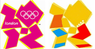
Above are two logos that I really don't like. I used to be a gril scout and I always thought the logo was pretty bland. The other logo is the official logoo for the 2010 summer olympics in London. The numbers in the design aren't clearly designed and the typeface used is really hard to read. The colors used don't best reflect the brand or the event.
The FedEx icon is simple and I always thought it was pretty cool that it had an arrow in it. It'd be cool if it was a tad bit more obvious.
ReplyDeleteI've got to say, I was always really fond of the girl scout logo. Unfortunately, though, there's something about it that looks a little dated. I'm pretty sure this one was created in the early 1970s, and it REALLY looks like it . . . still think it's cool-looking, tho.
ReplyDelete