Monday, November 29, 2010
Illustrator + InDesign + Photoshop = FUN!
I'd imagine working with all three programs wouldn't be much of a issue seeing as though each could offer some type of unique addition to a newsletter. First I would start by creating some type of logo or emblem for the newsletter using Adobe Illustrator. I've learned through our brief time using Illustrator, this program is excellent for creating logos. Depending on if I would like to resize, crop, or alter images for the newsletter I would use Adobe photoshop. Finaly I would design and create the newsletter using InDesign. I'm most familiar with this program and would prefer using this software design the newsletter.
Wednesday, November 17, 2010
The Apple Brand
This week we were expected to complete a post on the following.--> Post an advertisement for a company that you think is well-branded. Talk about how their brand is seen in light of that particular ad or ad campaign.
In my opinion Apple branding is one of a kind. Their branding/marketing department deserves every last penny they earn. The master mind team almost always successfully accomplishes a well thought out, strategic plan and placement of advertisements. I remembered living in New York looking at iPod ads in the subway stations thinking to myself, "I know I have a iPod but maybe I need a new one because these ads are soooo cool". Apples branding and advertisements usually drive consumer want and not consumer need. They position their products as a luxury of sorts not a necessity.
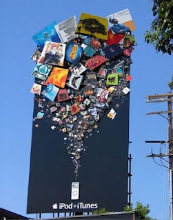
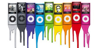
The brand is very colorful and usually bold in statement. I remember the color iPod nano ad campaign. I saw ads like the one featured below, plastered all over subway stations, billboards and commercials. Again, I think apple products are pushed onto the consumer by the company. We don't necessarily need a new version of the iPod Nano every holiday season. They create a new product and through clever advertising convince the masses this IS what you need. Regardless, I find their marketing/advertising very successful seeing as though I've purchased 2 iPods, 2iPhones, and just recently purchased a Mac Book. (All of which I didn't really need, except for the MacBook)
In my opinion Apple branding is one of a kind. Their branding/marketing department deserves every last penny they earn. The master mind team almost always successfully accomplishes a well thought out, strategic plan and placement of advertisements. I remembered living in New York looking at iPod ads in the subway stations thinking to myself, "I know I have a iPod but maybe I need a new one because these ads are soooo cool". Apples branding and advertisements usually drive consumer want and not consumer need. They position their products as a luxury of sorts not a necessity.

The brand is very colorful and usually bold in statement. I remember the color iPod nano ad campaign. I saw ads like the one featured below, plastered all over subway stations, billboards and commercials. Again, I think apple products are pushed onto the consumer by the company. We don't necessarily need a new version of the iPod Nano every holiday season. They create a new product and through clever advertising convince the masses this IS what you need. Regardless, I find their marketing/advertising very successful seeing as though I've purchased 2 iPods, 2iPhones, and just recently purchased a Mac Book. (All of which I didn't really need, except for the MacBook)

Tuesday, November 9, 2010
Brand/Logo Recognition


Above are two logos that I really don't like. I used to be a gril scout and I always thought the logo was pretty bland. The other logo is the official logoo for the 2010 summer olympics in London. The numbers in the design aren't clearly designed and the typeface used is really hard to read. The colors used don't best reflect the brand or the event.
Wednesday, November 3, 2010
Positive vs. Negative Color
Last class we briefly learned about the role color plays in our designs. So I looked through a view Essence Magazines to try and find spread where the color worked well and maybe not so well with the spread/design. Below are my two choices.
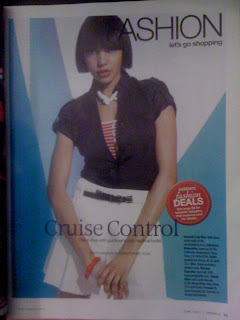
Here is a copy of color working positively within the spread. The model is wearing a white skirt, blue jacket, and red and white stripped top. The background is very simple, but a great use of color to liven up the page. The two shades of blue are used as spotlights in the spread and provide a excellent contrast.
 Below is a copy of a spread using color negatively. I actually think there is entirely too much color in this spread which can cause some distraction. I understand the purpose of the advertisement is to highlight the artist featured in the upcoming Essence Festival, but I'm too distracted by the colors and shapes to really comprehend what's most important. It doesn't seem like there is a clear color palette, just a few pretty colors thrown on to a page.
Monday, November 1, 2010
Tricks We've Learned in Photoshop
 Here's a picture I took from the top of a Mayan Ruin in Cancun. I love this picture because it represents me finally confronting my fear of falling. (I know kind of weird) I climbed to the very top and could see clear over the tops of the trees expanding the entire jungle. Sooooo.... I decided to play around with a few filters of this picture because I love this tool.

Subscribe to:
Comments (Atom)